Designing a new look for Mayoral
Our creative process for designing the new retail space for mayoral
Mayoral contacted us and asked us to design a new look for their physical stores. This children’s fashion brand needed to improve several aspects of its retail design and create a more versatile space that would make it easier for customers to access their products.
Brand analysis: strengths and weaknesses.
We saw that the brand needed to improve its sales approach and how they displayed their products. The previous structures were very static and did not allow staff much creativity when it came to displaying their products.
The main drawback of this system was that the store looked very similar from season to season. As a result, the new collections failed to make an impact, nor did they pique the interest or curiosity of the customer.
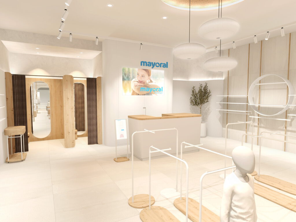
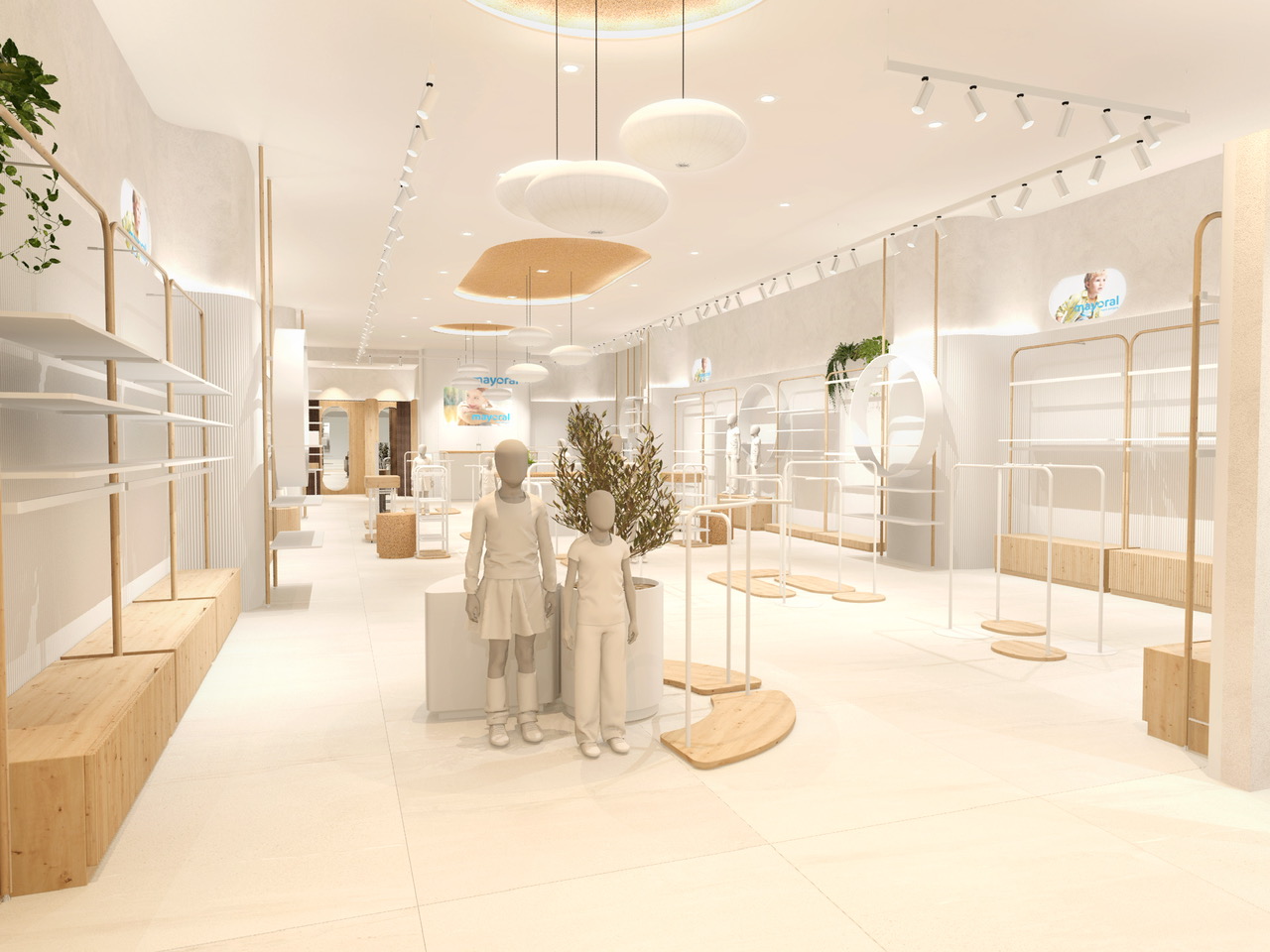
We therefore set about designing a new look with much more versatile retail furniture. Our aim was to maintain the essence of current trends by using organic shapes, curves, and natural materials.
As designers at Tribeka Studio, we wanted to create a striking and eye-catching look that made passers-by curious enough to go inside.
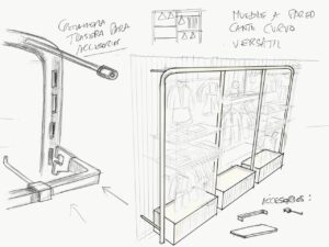
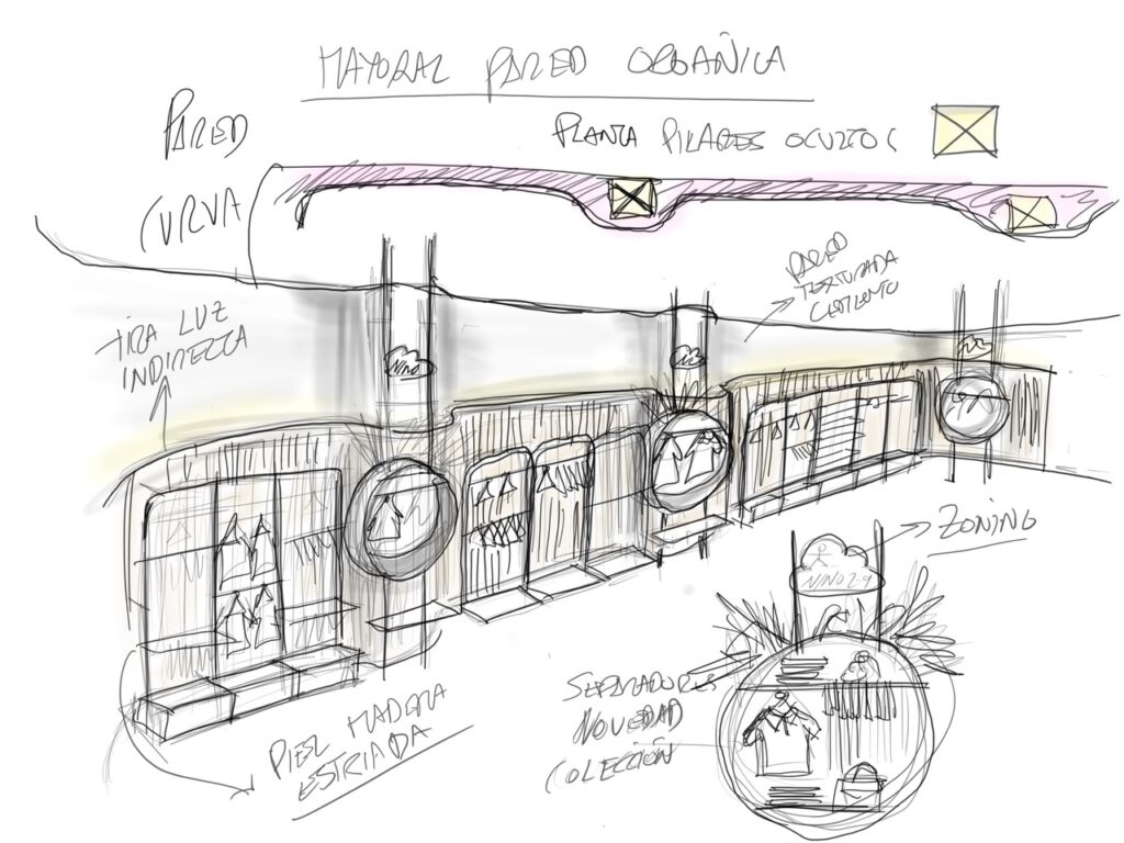
Perimeter furniture.
We chose metal racks built from round tubes with concealed slots, which we gave a false wood grain finish, allowing us to obtain a warm and organic feel.
Central furniture.
Here, we played with round shapes with the tubes and base structures. What’s more, by deconstructing the Mayoral logo and creating organic shapes, we were able to incorporate parts of its image into the furniture and ceiling panels.
As a result, we managed to subtly infuse all elements of the store with the brand itself. We love adding these kinds of details into our projects in order to personalise the design as much as possible, thereby representing the brand in as many elements as possible.
Materiales.
We chose to use natural and sustainable materials to create a softer and more friendly design. We wanted the shop to have an inviting appearance, one that encourages people to spend time inside.
We applied stucco to the walls to create a curved skin of textured wooden mesh, which gives the impression of a “living” wall. We tried to make sure that there were no sharp edges on any of the vertical displays, in an attempt to almost caress the furniture and the clothes on display.
Lighting.
Lighting is a hugely important aspect of the design. We used powerful white projectors with a warm light of 3,000K and 24º optics, in other words, a lot of warm light, which was directed onto the products themselves.
Exterior design.
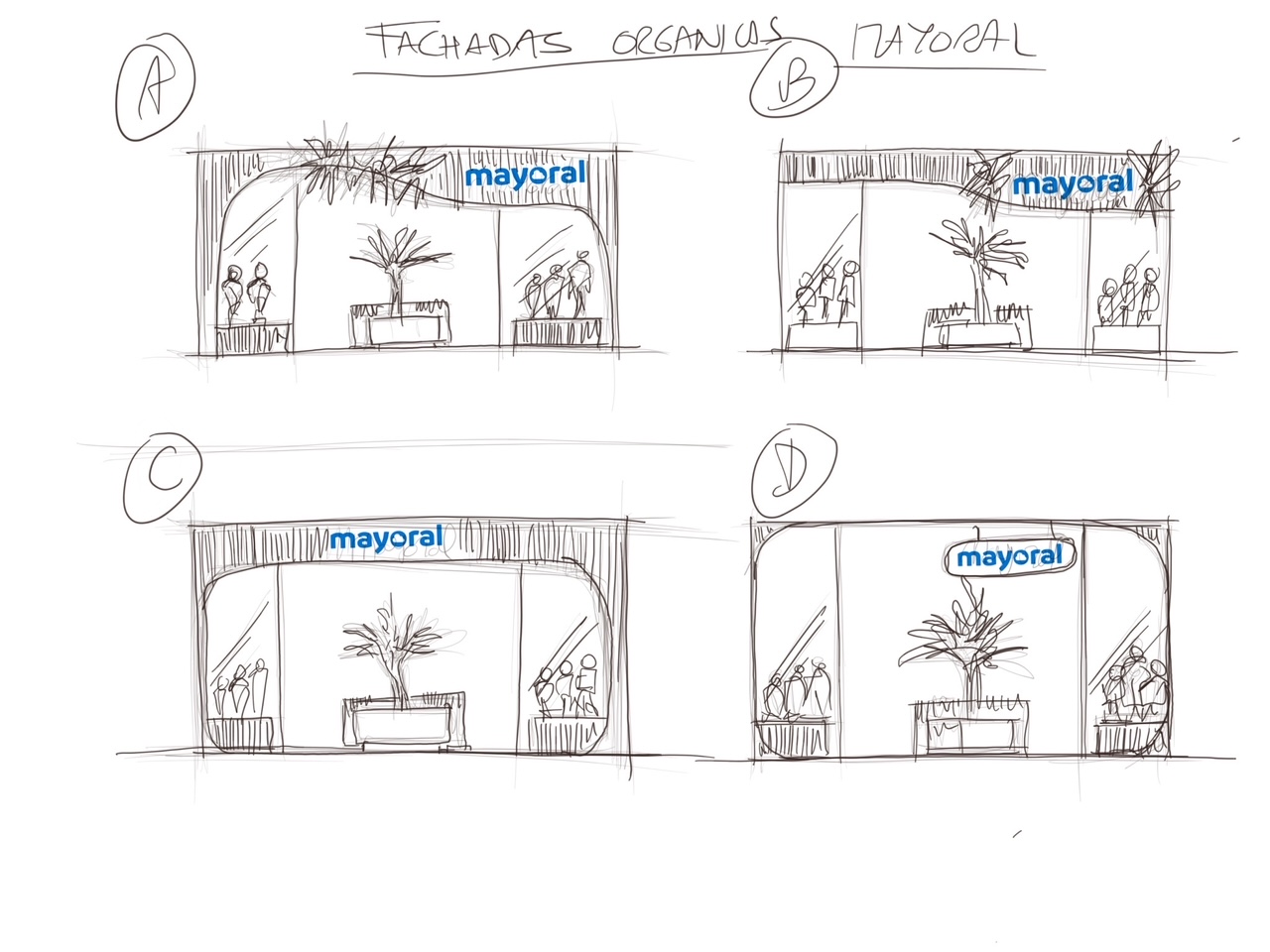
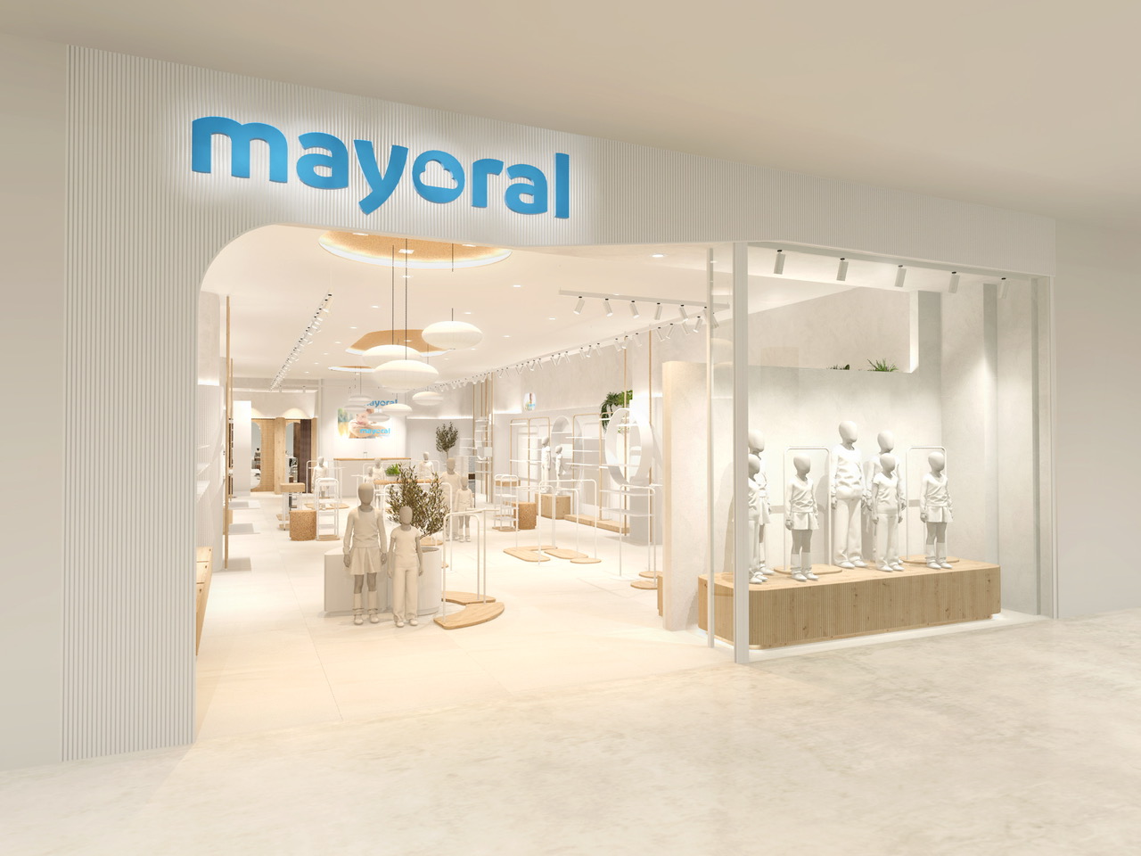
The façade features the same grooved wood as the interior, almost like presenting a statement of intent before customers enter. We like to represent the materials we use in all areas of the shop so that the design breathes coherence and homogeneity.
The first presentation to the client.
Once we had decided on the decorative and structural elements of the design, we set up a mock-up of the furniture in corner of the Mayoral offices. This communication ensures that both parties are on the same page and that the process runs smoothly, as well as offering us and the client the chance to change or add details, if necessary.
This step helps us see that the design works, while staying true to the idea the brand requested:
Warm, friendly, technological, organic and fresh.
It is also a great opportunity to see how the products could be displayed in the shop.
This new design has achieved the following.:
- A more current overall image. The lighting, materials and shapes respond to both the needs of the brand and current retail design trends.
- Greater versatility in the distribution of shelving and interior furniture.
- We built multi-product displays that combine high tables, nesting tables and minimalist gondolas for hanging products, as well as accessories to encourage customers’ imagination and increase the number of items per sale. We added mannequins to create mini-window displays inside the shop, which helps the customer see several looks that tell different stories. It also creates an organised setting and the clear idea of a collection
- The improvements in lighting create a brighter look and focus the intense but warm light on the product.
- The façade is more attractive, with curved shapes that convey an organic feel from the outside in, so that customers get a feel for the store before they’ve even gone inside.
- We gave the shop windows a more striking look by using furniture with organic shapes and the same materials we find inside: warm grooved wood and curved podiums. All showcases and displays are simple, which allows the products to take centre stage.
In short, the focus of this retail design for Mayoral was the product, not the decoration. We stripped away all distractions in order to present the clothes and accessories in all their glory.
.
